Artist, Photographer, Explorer, Chef, Writer, Psychologist, Masseur...
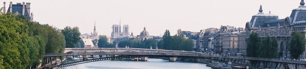
The purple text is hard to read over the photo background. Other than that, looks peachy.Although: Have you considered putting a big photo of me as your header? That's my recommendation.
Karla, a photo of you was my first choice, but I didn't want people to get the wrong idea about us.I am rethinking the photo cuz I do like my purple. You're right, it is a tich hard to see.
I agree with Karla. Great photo, but the purple gets lost in the bushes.
Post a Comment
Where does six years go? In the blink of an eye, she’s gone. I can still see myself, sitting down with my new iPad, this iPad, and writing ...


3 comments:
The purple text is hard to read over the photo background. Other than that, looks peachy.
Although: Have you considered putting a big photo of me as your header? That's my recommendation.
Karla, a photo of you was my first choice, but I didn't want people to get the wrong idea about us.
I am rethinking the photo cuz I do like my purple. You're right, it is a tich hard to see.
I agree with Karla. Great photo, but the purple gets lost in the bushes.
Post a Comment